The experiment
We wanted to know how much of a template's job an AI app builder can actually do, so we ran a real test. We gave emergent.sh, a general AI app builder on its free tier, a brief across two escalating rounds: round 1 with a naive adjective prompt, round 2 with a structured style pass. Both used the same fictional skincare brand, PURE ESSENCE, so the only variable was prompt discipline, not the brief. Across the experiment we used the same prompt patterns from our free Teardown Kit: P1 for structure, P2 for style direction, P3 for palette direction, P6 for one-line fixes.
Round 3 changed the brief on purpose. Instead of a third pass at PURE ESSENCE, we gave emergent.sh a brand it had never seen: a fictional Tokyo watch atelier called TOKI, prompted with the full method combined into one shot, plus explicit photo direction. Round 3 isn't testing whether the tool improves with practice, it's testing whether the method transfers to a brand it wasn't tuned around, the harder and more useful question.
What follows are 4 screenshots, one per round, as the evidence, not a summary of what we remember happening.
Round 1 — adjectives get you generic
The first prompt was deliberately naive, the way most people actually start typing into an AI builder: premium, minimal, elegant, for a skincare brand. No structure, no palette, no photo direction, just adjectives.
Emergent.sh produced a working, published page for a brand it named PURE ESSENCE. It was also completely interchangeable: a centered hero with two competing buttons, a headline that could sit on any wellness brand ("Reveal Your Natural Radiance"), a three-icon trust section, and a product grid behind category filters that added complexity without personality.
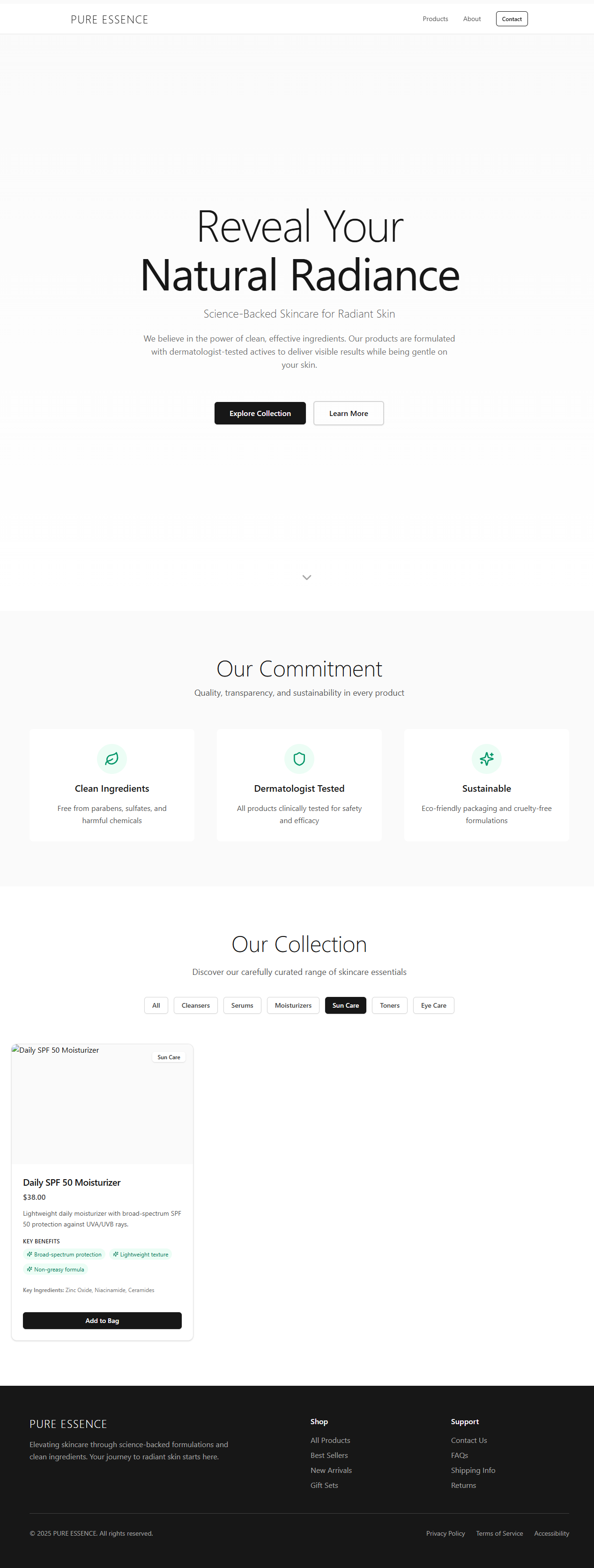
We've written about why this happens before: AI models default to the statistical average of their training data, and "premium, minimal, elegant" is vague enough that the average is exactly what you get. See our breakdown of why AI websites look the same. Round 1 wasn't a failure of emergent.sh specifically. It's the same pattern we documented against other tools, confirmed again on a new one.
Round 2 — structure works, photos don't
For round 2, we kept the same PURE ESSENCE brief and applied a structured style pass adapted from Prompt 2 in our Teardown Kit's prompt library, the pattern we use to art-direct MOTO and ASAGIRI: a background tone, one accent color, two type voices instead of an open choice, a single CTA instead of two, a vertical signature mark at one edge, and product photography kept "[muted]," nothing more specific.
The structural instructions landed. The second button disappeared, the palette settled into a warm cream and forest green with nothing pure white or pure black in it, a vertical "PURE" mark appeared at the left edge, and the type pairing read as intentional, not default. This is the part of the job an AI builder is genuinely good at: layout and color, on explicit instruction.
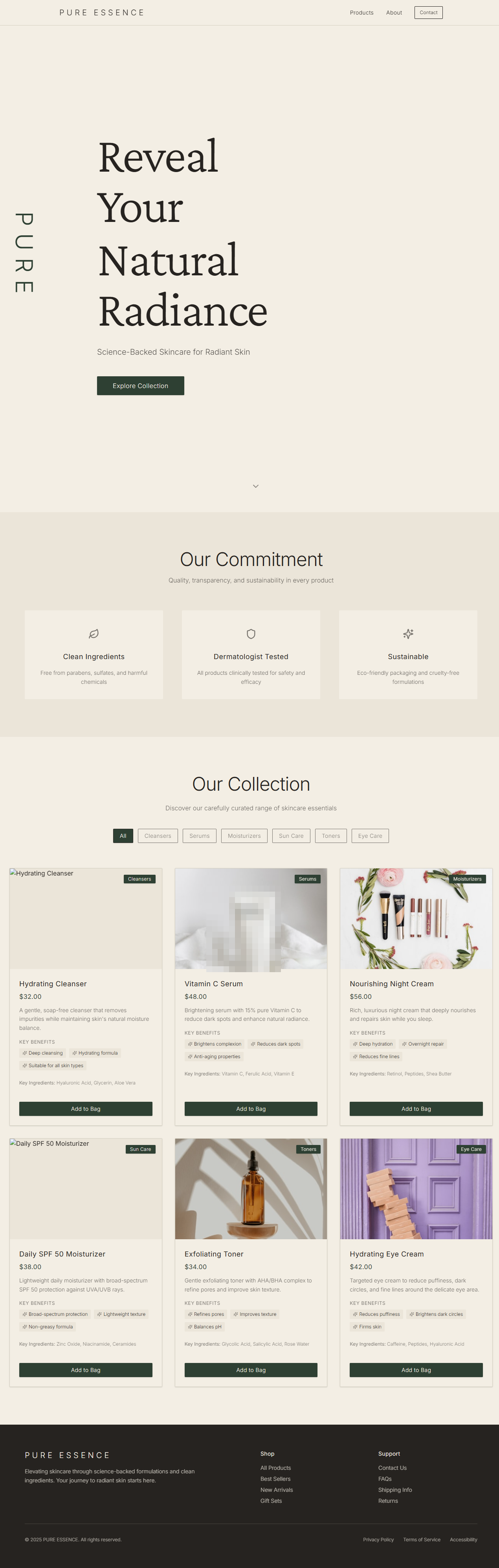
The photography is where it broke. "[Muted]" did far less work than we assumed. Two of the six product photos read as generic stock, not skincare: a "Nourishing Night Cream" illustrated with a flatlay of makeup brushes and carnations, a "Hydrating Eye Cream" illustrated with stacked wooden blocks against a purple door. Neither has anything to do with the product it's selling. A third miss was quieter: the "Vitamin C Serum" card turned out to be a photo of a real brand's lotion tube, label legible — more on that in round 3. A one-word photo direction wasn't a direction, it was a suggestion the model was free to ignore, and it did.
That gap is what round 3 was built to close.
Round 3 — the five-part prompt gets you 80%
Round 3 used the full method on a brand-new brief: the Teardown Kit's structure, style, and palette prompts combined into one shot, plus explicit photo direction instead of a bracketed adjective. Where round 2 said "[muted]," round 3 said dark and calm, in a full sentence.
The result was close to a finished site on the first attempt, on a brand the tool had never touched. Emergent.sh built a midnight-indigo hero against paper-white type, with one gold accent doing all the work: a serif "TOKI" logotype top-left, the tagline "Independent mechanical watch atelier, Tokyo," a single gold CTA button, and one large gold kanji, 時 (the character for "time," the reading of "toki"), at the right edge. Below the fold, a three-item product grid, watches named by the tool itself, unprompted: Mugen, Seijaku, Yūgen, a coherent set of Japanese aesthetic terms we never asked for.
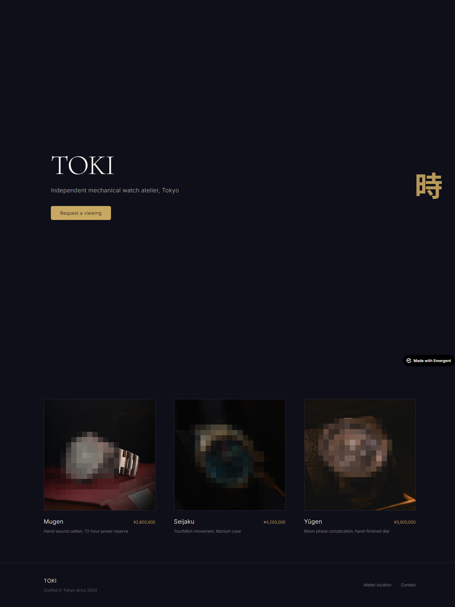
The photography succeeded this time for the same reason round 2 failed: direction was explicit. "Dark, calm" is a mood a model can act on. "[Muted]" is a placeholder it can interpret however it wants. That contrast is the actual finding: vague photo direction fails, specific direction works, and the gap sits entirely with the prompt writer, not the tool.
Three things still needed a human eye before this could ship.
The whitespace over-achieved. We'd asked for roughly 40% negative space in the hero, the same instruction from our Teardown Kit's style pass. Emergent.sh took it further than intended, producing a genuinely empty void between hero and product grid. We fixed it with one line, the Kit's P6 pattern for narrow fixes: name what's wrong, say where, state the rule it violated. That one line compressed the page from over 2600px of scroll height down to 2041px, measured before and after.
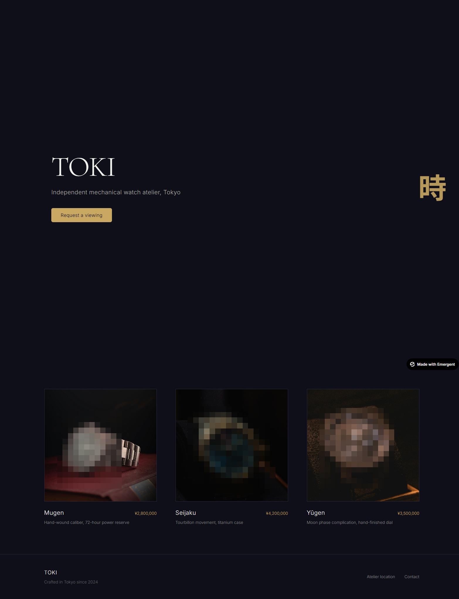
The product photos had a trademark problem. The second watch, Seijaku, showed a legible BREITLING dial, and the third, Yūgen, a readable "CHRONOMETER NAVITIMER" — another Breitling. Round 2 had the same issue in disguise: its "Vitamin C Serum" was a real Nécessaire body-lotion tube. Nothing in any prompt asked for a real brand, and whether the builder generates an image or pulls a stock photo, nothing in the pipeline flags whose product is in frame. That's a legal landmine no prompt catches automatically — we had to notice it ourselves, and every screenshot in this piece is pixelated where a real brand appeared. A human has to do that pass before anything ships.
The platform badge stayed. A "Made with Emergent" badge sat in the corner, on both the original and the fixed version, the kind of platform watermark that's easy to miss if you're judging layout and color, not checking every corner.
None of these three are exotic problems. They're the ordinary review pass a person still has to do after an AI builder finishes: check the spacing did what you meant, check the photos aren't someone else's, check there's no watermark left behind. That review pass is exactly what a template skips, because someone already did it once.
Framer templates vs building from scratch with AI: a side-by-side
Round 3, on a brief the tool had never seen, is the best case for building from scratch with AI: full method, explicit direction, still 3 things a human had to catch. Here's the AI website builder vs template trade-off, on what actually matters when you're shipping.
| Template | Building from scratch with AI | |
|---|---|---|
| Time to first decent result | Fast — it already looks finished when you open the editor | Slower — even with a structured prompt, still needs a review pass afterward |
| Cost | One-time template price | Free tier, but metered: credits went 10 to 3.46 after 2 builds, nearly gone after round 3 plus the fix — about one night of free-tier use for 3 projects |
| Design-quality floor | Set once, by the designer, before you ever open the editor | Set by your prompt discipline: round 1 and round 3 used the same tool with wildly different results |
| Licensing / brand safety | Cleared once, by the template creator | Your responsibility every time: rounds 2 and 3 both shipped real branded products that needed a manual trademark check |
| Control | High, inside the template's system | High, but every decision (including ones you didn't think to make) is yours to catch |
| Maintenance | Template creator ships updates | You're the only one who knows how it was built |
Nothing here is a knock on emergent.sh. It did what a general-purpose AI app builder is supposed to do: take a structured prompt seriously and execute it well, on the first try, on a brand it had never seen. The credits and the review pass are the real cost of that, and most comparisons skip both.
Which should you choose?
Build from scratch with an AI app builder if you enjoy the prompt-engineering part of this, and if you (or someone on your team) can review the output with a designer's eye and catch what round 3 didn't catch on its own: whitespace that went too far, a photo that isn't yours to use, a badge nobody meant to publish. Round 3 proves that's achievable, not hypothetical, but it took a documented method and a fresh brief to prove, and it's still not push-button.
Use a template if you want that last 20% closed before you start: a quality floor that doesn't depend on your prompt-writing, and licensing already cleared so you're not squinting at a watch dial wondering if it's someone else's product. That's not a lesser path, it's the same destination with the review pass already done. If you go this route, customizing it without breaking the design is the next real question worth answering.
We're not going to tell you templates always win: round 3 is genuinely good, good enough that "which one" is a real question, not a foregone conclusion. What we'd say instead: know which 20% you're signing up to catch yourself before you pick. The same discipline scales past static pages, too: we used it to build an Apple-style scroll animation from two AI images, and wrote up the prompts that failed on the way.
FAQ
Can AI builders create a Framer-quality site from scratch?
With a structured, five-part prompt and explicit photo direction, yes, close, even on a brand the tool has never seen. In our test, the same method that failed on product photography in round 2 produced a coherent palette, real typographic hierarchy, and a working layout on the first attempt against a brand-new brief. But close isn't done: it still needed a manual whitespace fix, a trademark check on the photos, and removal of a platform badge before publishing.
What do AI website builders get wrong?
In our test, the builder followed structural and color instructions accurately but struggled with anything left vague, most visibly photo direction: a one-word cue like "[muted]" produced wrong-mood stock imagery, while a full sentence ("dark, calm") produced the right mood on the next brief. It also over-executed a 40% whitespace instruction into an empty void, and left platform branding and real branded products in the imagery without flagging either.
Are AI-generated photos safe for commercial sites?
Not automatically, and neither are the photos an AI builder picks for you. In our test, product imagery twice included real branded goods — a legible BREITLING watch dial in one build, a Nécessaire lotion tube in another — brands no prompt asked for, with nothing in the tool flagging either. Whether an image is generated or stock-sourced, treat AI-builder product photography as a first draft that needs a human trademark and licensing check before it goes near a live commercial page.
Is it faster to customize a template or build from scratch with AI?
A template gets you to a finished-looking result almost immediately, because the design and licensing decisions are already made. Building from scratch with AI can get close, but only once you know a structured prompting method, and only after a review pass that catches whitespace, photo licensing, and platform badges. Across our 3 rounds, that method and review pass were the real time cost, not the generation itself.